


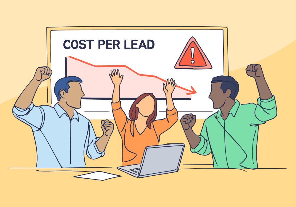
CPL dropped from $45 to $38. Your dashboard turned green. You sent the client a win report.
Two weeks later, the client asked why so many calls were going nowhere. The "improvement" wasn't an improvement at all—it was cheaper junk drowning out the good leads.
But here's the thing: you didn't know when it started happening. The aggregate number masked the collapse.
This article shows how plotting performance over time reveals exactly when “wins” turn hollow, so you can catch quality collapses early and course-correct before they show up in next month’s numbers.
Note: Not a WhatConverts user yet? Start your free 14-day trial today or book a demo with a product expert to see how we help prove and grow your ROI.
When Numbers Lie by Omission
Most marketers track performance month-over-month. CPL improved 15% in October compared to September, so October wins.
But that month-over-month view hides timing. What if the "improvement" happened because:
- A high-value campaign paused on the 15th?
- Lead quality tanked after a landing page change on the 22nd?
- Google's algorithm shifted targeting mid-month and started flooding cheaper, lower-intent clicks?
Aggregate reporting makes all of October look like success, when the real story is that the first two weeks were great and the last two were a disaster.
By the time you spot the trend in November's numbers, you've burned through three more weeks optimizing for garbage.
The Timing-Context Gap
You can't improve what you can't time-stamp. And most marketers can't time-stamp when performance actually shifted.
Here's what typically happens:
October 1–14: Campaigns generate 42 leads at $45 CPL. Lead quality is solid—sales closes 35%.
October 15: Google Ads auto-optimization kicks in after hitting a volume threshold. The algorithm starts chasing cheaper conversions.
October 15–31: Campaigns generate 68 leads at $33 CPL. Lead quality collapses—sales closes 8%.
End of month: Combined October stats show 110 leads at $38 CPL. Dashboard reports a 15% cost-per-lead improvement. You celebrate the win.
November: Sales complains that lead quality is trash. You're confused—October looked great.
The reality: October didn't look great. Half of October looked great. The other half was a collapse disguised by aggregate averaging.
Without plotting performance over time, you never see when the shift happened—and therefore can't tie it to what caused it.
Timeline Plotting Exposes Hollow Wins
Charts reveal what spreadsheets hide: timing.
WhatConverts’s Performance Trends chart plots ad spend against value-based outcomes over time. You see exactly when performance changed—not just that it changed.
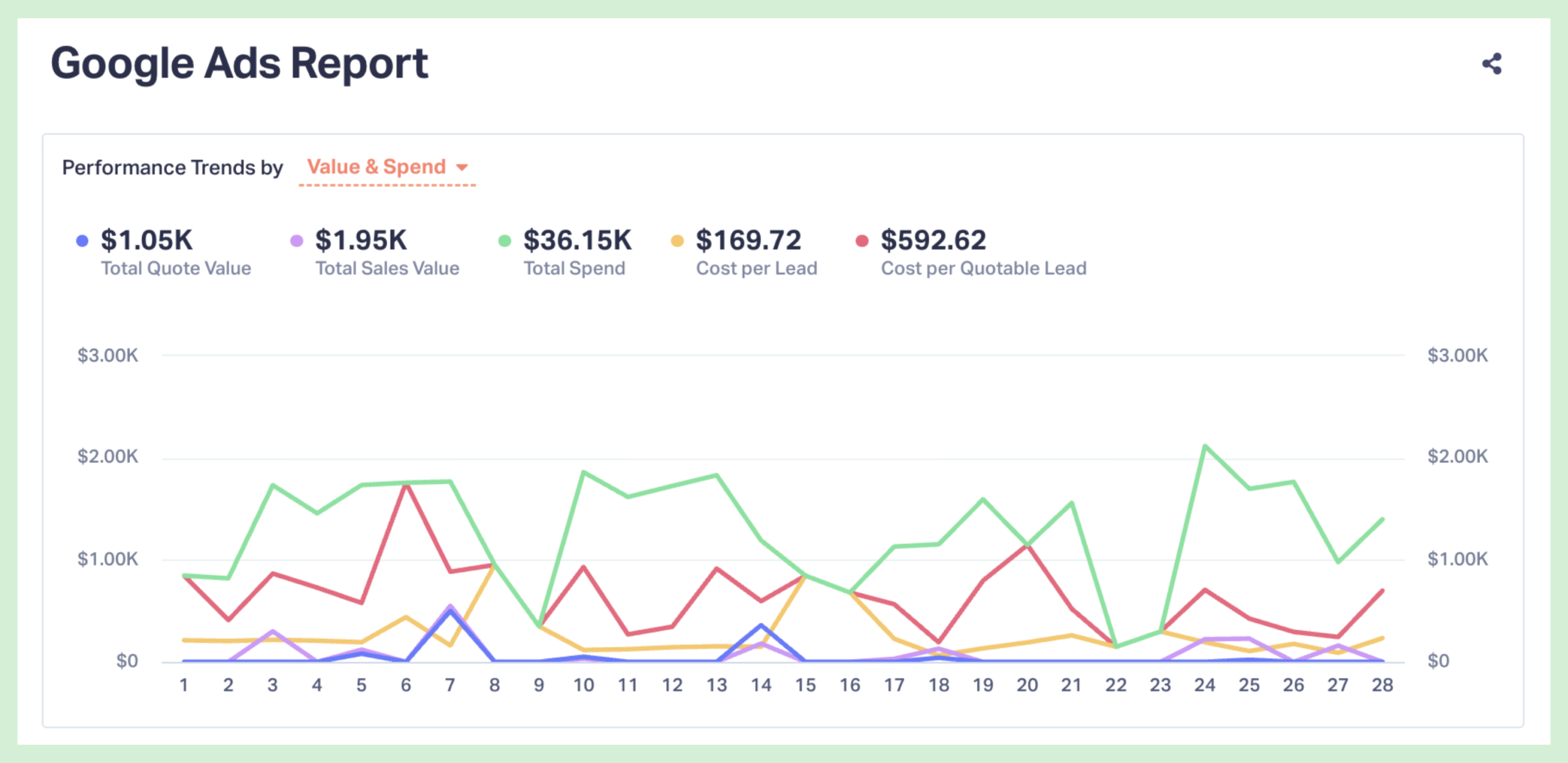
Track spend patterns.
Instead of "spent $36K in October," you see daily spend fluctuations. When spend stays flat but lead volume spikes, something shifted your targeting toward cheaper, lower-intent traffic.
Overlay quality metrics.
The chart shows Cost per Quotable Lead alongside total spend. When spend drops but cost per qualified lead rises, the CPL "improvement" is hollow—you're getting more leads, but fewer worth pursuing.
Spot inflection points.
See the exact day performance shifted. Did spend spike on day 23? Check what campaign changes happened that day.
Compare to external events.
Did you pause a campaign? Launch a new landing page? Adjust bid strategy? Plotting shows whether your optimizations caused the change or something else did.
When you chart metrics over time, patterns emerge that monthly summaries obscure. The CPL drop you celebrated? It started the exact week you changed your landing page headline to something generic. The algorithm delivered cheaper clicks, but they were lower-intent visitors who bounced.
That's not optimization. That's you accidentally teaching the algorithm to find cheaper junk.
What Timing Reveals That Aggregates Don't
Without time-series data, you're flying blind. With it, you spot:
- When improvements actually happened. If lead volume jumped on October 22 and you launched a new campaign on October 21, you have a clear cause-and-effect relationship to replicate.
- When quality collapsed. If lead qualification tanked the same week volume spiked, the CPL "win" was smoke.
- Whether changes are sustainable. One good week is noise. Four consecutive weeks is a trend.
- Which optimizations worked. Test A ran October 1–7 with 15 leads at $3,000 spend. Test B ran October 8–14 with 42 leads at $3,000 spend—but only 3 qualified. Aggregate data says Test B won. Time-series data says Test B was a disaster.
Plotting doesn't just show you what happened. It shows you when it happened—which is how you figure out why.
How to Stop Celebrating Hollow Wins
Stop looking at monthly snapshots. Start using Performance Trends to spot when metrics actually shifted.
Here's the process:
- Review the Performance Trends chart. Look at how Total Spend and Cost per Quotable Lead moved over the month—not just the totals.
- Mark external changes on your calendar. Note when you paused campaigns, changed landing pages, adjusted bids, or launched new ads. Match these dates to inflection points on the chart.
- Watch for quality divergence. When spend drops but Cost per Quotable Lead rises, your CPL "win" is hollow—you're getting cheaper leads that don't convert.
- Identify the inflection point. Spot the exact day performance shifted. Then investigate what changed.
- Course-correct immediately. If Cost per Quotable Lead spiked mid-month, don't wait until month-end to react. Revert the change, adjust targeting, or reallocate budget now.
WhatConverts makes this automatic. Every chart updates in real-time, showing daily trends without manual data exports. You see when performance changes as it happens—not three weeks later when the damage is done.
Scenario: The Campaign That Looked Great Until It Didn't
An agency celebrates a 20% CPL reduction in August. The client approved a budget increase based on improved efficiency.
Then September's sales data come in: close rate dropped 40%.
When the agency plots performance by week, the truth emerges. The CPL improvement started August 18—the exact day they expanded keyword targeting to capture "cheaper" clicks. Cost dropped. So did lead quality.
By charting daily trends instead of relying on monthly summaries, they spot the problem in real-time and revert the change before burning through the expanded budget on junk leads.
Timing reveals what aggregates hid: the "improvement" was a warning sign.
The Bottom Line
Month-over-month comparisons tell you what changed. Time-series charts tell you when it changed—and that's how you figure out why.
The CPL drop might be a win. Or it might be the week your targeting collapsed and the algorithm started chasing garbage. You won't know unless you chart it.
Ready to stop celebrating hollow wins and start seeing when performance actually shifts?
Start your free 14-day trial of WhatConverts today or book a demo with a product expert to see how we help prove and grow your ROI.
Get a FREE presentation of WhatConverts
One of our marketing experts will give you a full presentation of how WhatConverts can help you grow your business.
Schedule a Demo
Grow your business with WhatConverts


