


Understand the Report Builder
The Report Builder is your custom reporting workspace in WhatConverts. It’s where you turn data into actionable insights by choosing the dimensions, metrics, and visualizations that matter most to your business.
This article explains every part of the Report Builder so you can understand what each component does, how to use it effectively, and how it helps you uncover deeper marketing and sales insights.
Report Builder Interface Overview
The Report Builder interface is divided into two main areas:
- Sidebar: Configure your report by selecting dimensions, metrics, and filters
- Main View: Visualize data in charts or tables.
Use the sidebar to design your report and the main view to analyze your results. All updates appear instantly as you make selections.
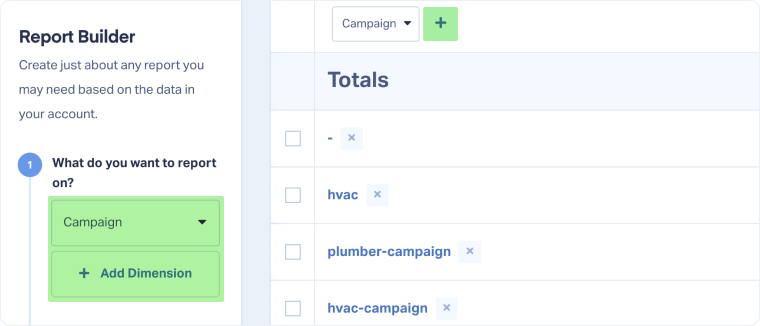
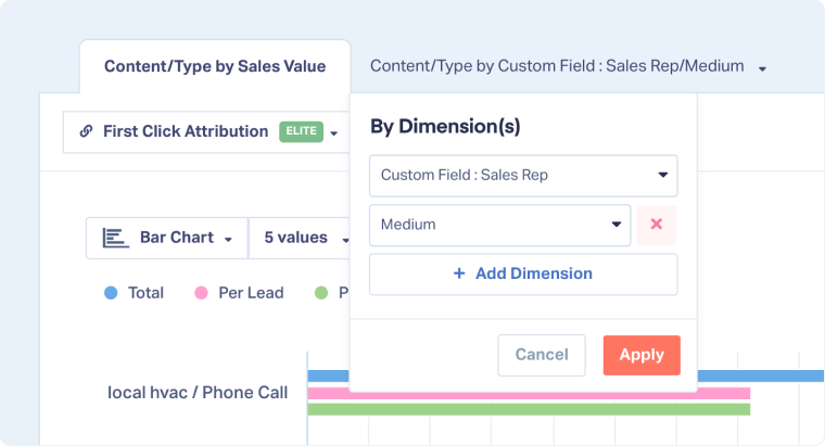
Dimensions: What Do You Want to Report On
Dimensions define how your data is grouped and displayed (e.g., bySource,Campaign,Service, orSales Rep).
You can add up to five dimensions from the dropdown “What do you want to report on?” or directly from the table view.
Include standard fields, Custom Fields, and Field Mappings to tailor reports to your business needs.
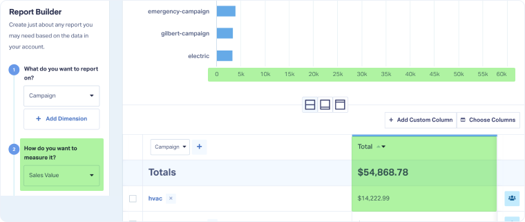
Metrics: How Do You Want to Measure It?
Metrics determine what you’re measuring within your selected dimensions, such as lead count, quote value, or total sales.
Select your preferred metric under “How do you want to measure it?”.
Common options include Lead Type, Quotable Leads, Quote Value, and Sales Value.
Filters
Filters narrow your report to the data you want to analyze.
Click “Add Filter” and select any available field. Add multiple filters or remove them anytime.
Note: Filters apply to the entire report1
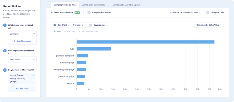
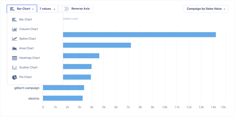
Chart Types
Visualize your data in the format that best communicates your findings.
Select a chart type from the dropdown above your report. Options include Bar, Column, Area, Pie, Scatter, and Heatmap charts.
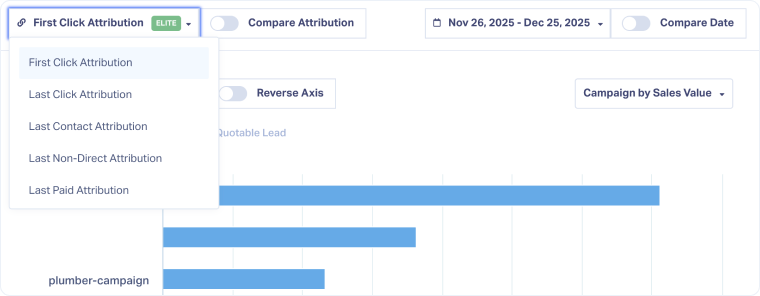
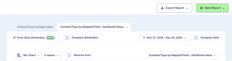
Attribution Model Selector
Choose which marketing touchpoint gets credit for conversions.
Select a model from the dropdown above your chart (e.g.,First Click,Last Click).
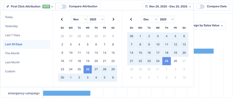
Date Range Selector
Control the time frame of your report.
Select a range from the top-right corner (e.g.,Last 7 Days,This Month) or set a custom date range.
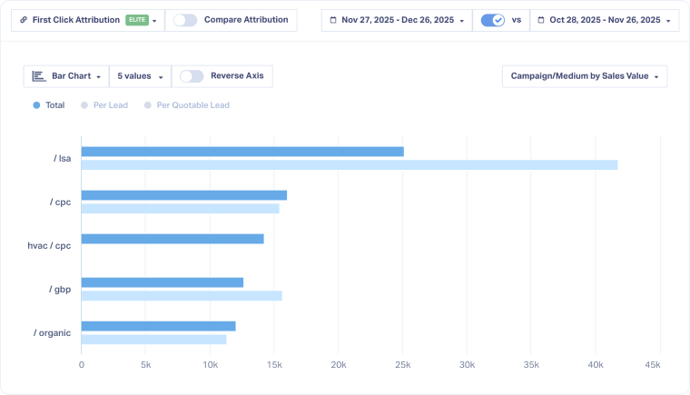
Compare Time Periods Toggle
Compare performance across two different time periods.
Turn on “Compare Date”, then select the date range to compare.
Your chart shows both time periods, and the table highlights percentage changes.
Reverse Axis Toggle
The Reverse Axis toggle changes how your chart displays data, switching the focus between your dimensions and metrics.
Click the “Reverse Axis” toggle above your chart:
- When off, each bar or column represents a dimension (for example, campaigns), and the colors within each bar represent metric segments (like calls, forms, or chats when your metric is lead type).
- When on, each bar or column represents a metric, and the colors represent dimensions (for example, individual campaigns).
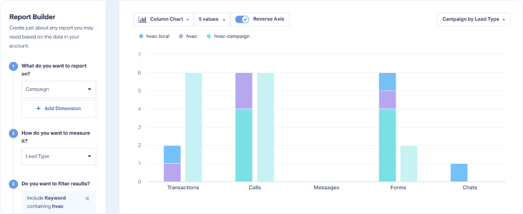
Note: Reversing the axis is essential when using Timeline Views.
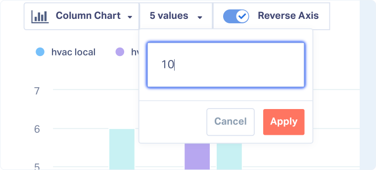
Number of Values Displayed
Control how many data points appear in your chart.
Select the custom number of values from the dropdown field.
Timeline View Selector
The Timeline View Selector lets you display results over time instead of by category.
Use the dropdown near your date range to switch from your standard view (defined in the sidebar) to a timeline view based on your selected dimension(s) or metric.
You can choose to group results by day,week, ormonth.
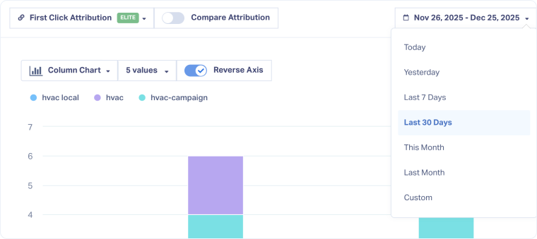
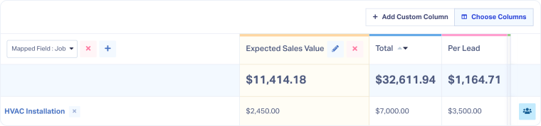
Table View
View and analyze your detailed data in table format.
You can sort, filter, or open specific leads directly in the Lead Manager for deeper analysis.
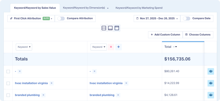
Note: Changes in the table view also apply to the chart view and vice versa
Tip: Use the cross icon next to a segment to exclude it from your report
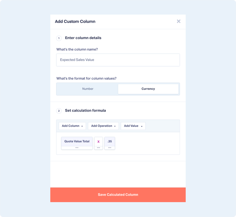
Add Custom Columns
Create your custom calculated columns to track specific metrics or formulas.
Click “Add Custom Column” from the table view, then:
- Enter the column name
- Choose the format (Number orCurrency).
- Set the calculation formula by combining columns, operations, and values.
Choose Columns
Customize which columns appear in your table.
Click “Choose Columns” and select the ones you want to display.
Note: Some columns may also affect your chart view
Different Tabs
The Report Builder includes up to two tabs (plus Marketing Spend, depending on your setup).
The first tab reflects the sidebar configuration, while the second allows comparison using different dimensions.
Save Report
Save your report for future access or collaboration.
Click “Save Report”, name your report, and choose a category in your Report Library.
For detailed steps, see Save a New Custom Report in the Report Library.
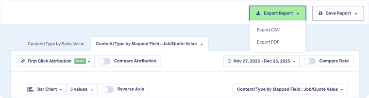
Export Report
Export or share your report internally or outside WhatConverts.
Click “Export Report” and choose your preferred format (CSV or PDF).
Related Topics
Get a FREE presentation of WhatConverts
One of our marketing experts will give you a full presentation of how WhatConverts can help you grow your business.
Schedule a Demo


