


Create Custom Reports With the Report Builder
Who has access to this feature?
Available on: Pro and Elite Plans
Access level: All Users
Create fully customized reports in the Report Builder to visualize your marketing, sales, and lead data exactly how you want to extract the insights you need to prove ROI and make data-based decisions.
Step 1. Choose Your Dimensions
Dimensions define what you want to analyze. You can combine up to five dimensions for more detailed insights:
- Access the Report Builder.
- Under “What do you want to report on?”, select a primary dimension.
- Optionally, click “+ Add Dimension” to include additional breakdowns (e.g., Source + Campaign + Service).
Tip: Choose dimensions that align with your business questions, such as “Which campaigns generate the most revenue?” or “Which services produce the most leads?”
Step 2. Choose Your Metrics
Metrics define how you measure performance.
- Under “How do you want to measure it?”, select a metric like Lead Type, Quote Value, or Sales Value.
- The chart and table will automatically update based on your selections.
Tip: Use Sales Value or Quote Value to understand revenue and ROI, or Lead Type to compare call, form, and chat performance.
Step 3. Add Filters
Filters help clean and narrow your data to focus on specific campaigns, sources, or services.
- Under “Do you want to filter results?”, click “+ Add Filter”.
- Choose a dimension to filter (e.g., Source).
- Select a match type such as Exactly Matching or Contains.
- Enter your value under expression (e.g., google).
- Click “Add” to apply the filter.
- Optionally, repeat the process to add more filters.
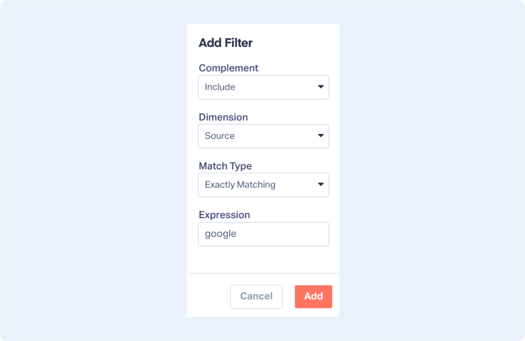
Tip: You can also exclude values directly in the table view using the “×” icon next to any dimension.
Step 4. Customize Your Report
You can tailor how your report looks and what data it shows:
- Select a chart type: Choose between bar, column, line, pie, scatter, or heatmap.
- Adjust the number of values: Limit your chart to your desired number of results for clarity.
- Reverse Axis: Swap the position of your dimensions and metrics.
- Set a Date Range: Choose a specific time period using the calendar picker.
- Compare Time Periods: Toggle the option next to the date selector to compare results over different ranges.
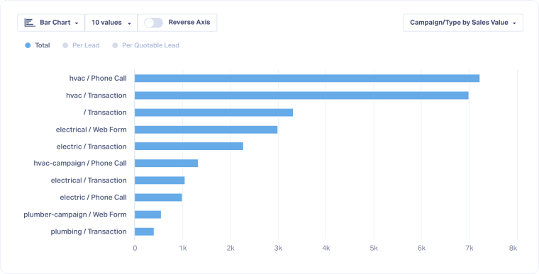
Tip: Try switching between chart and table views to see both visual and numeric insights.
Step 5. Review and Refine in the Table View
Below your chart, you’ll see a table version of your data for deeper analysis.
- Sort by any column by clicking its header. This will also sort the chart.
- Use Exclude icons to remove blanks or irrelevant values.
- Add or remove columns with Choose Columns.
- Add Custom Columns to visualize specific metrics.
Tip: Use the table view to validate your data and access the Lead Manager as needed by clicking the View Leads button.
Step 6. Save or Export Your Report
Once you’re happy with the results, you can keep your configuration for later or share it.
- Click “Save Report” to store it in your Report Library.
- Click “Export Report” to download your data as a CSV or PDF.
Tip: For more details, see Save a New Custom Report in the Report Library and Access Pre-built Reports from the Report Library.
Related Topics
Get a FREE presentation of WhatConverts
One of our marketing experts will give you a full presentation of how WhatConverts can help you grow your business.
Schedule a Demo


